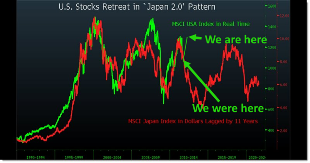
As an investor, I always like to go back and review my thoughts and see if I still agree with myself. Back in August, Barry Ritholtz (The Big Picture) posted a chart comparing the US and Japanese markets, with the following commentary:
Where our Fed stepped up and flooded the system with liquidity, the Japanese central bank did not. Whether that means the US avoided a Japan like decade plus long recession, or merely delayed it, has yet to be determined . . .
I had this to say:
With the sell-off in equities in the month of August, the U.S. markets are now mirroring the Japanese sell-off back in 2000. From a technical analysis perspective, the chart below is creepy. It suggests that US stocks could fall a lot more.
So what does this chart look like today? We’ve had a pretty strong run-up since the end of 2011, so it has to look much better…right? I decided to hack up a screenshot of the comparison posted on Barry’s site with my approximation of where we are today. I used data from the MSCI index (you can find it for yourself here – http://www.msci.com/products/indices/size/standard/performance.html). So the numbers are close, even if my artwork isn’t.
It looks like we’re headed in the right direction, but we still don’t know with any certainty whether US stocks continue to rise or if we just prolonged an inevitable fall. Here’s to hoping for the former, but planning for the latter.
Sources:
Japan 2.0 Chart Pattern
The Safe Investing Blog
http://www.ritholtz.com/blog/2011/08/turning-japanese-spx-vs-nikkei-index-10-year-lag-2/
Turning Japanese: SPX vs Nikkei Index (10 Year Lag)
The Big Picture
http://www.ritholtz.com/blog/2011/08/turning-japanese-spx-vs-nikkei-index-10-year-lag-2/


